Project 3—1: Design
Create detailed, refined, responsive designs in indesign (desktop/tablet/phone).
As mentioned before we have 3-4 unique page designs: HOME, ABOUT, PORTFOLIO overview, and CLASS/PROJECT pages.
Below a schematic example of this:
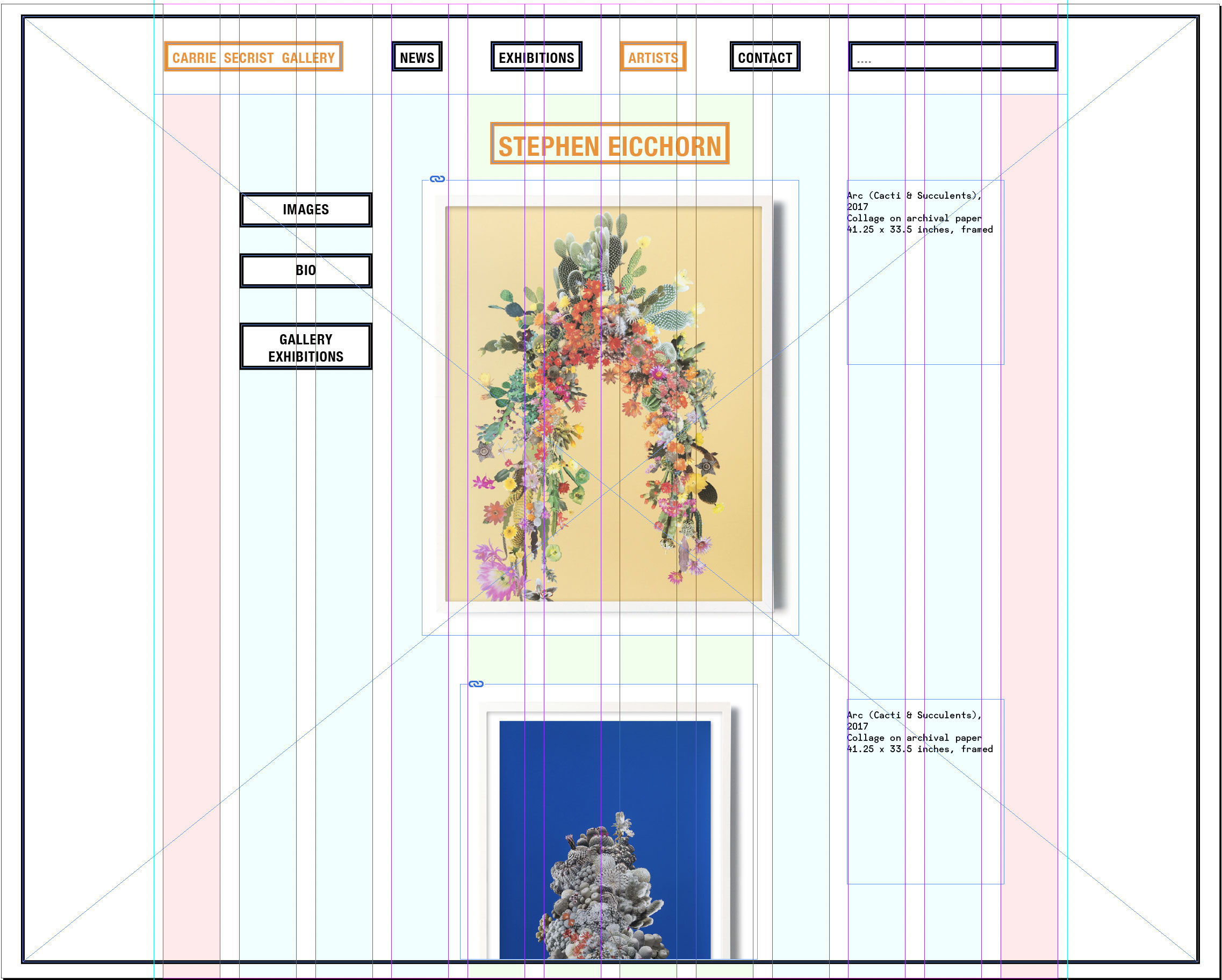
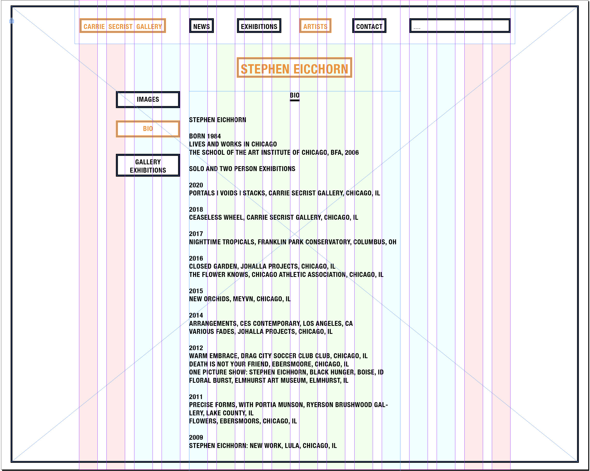
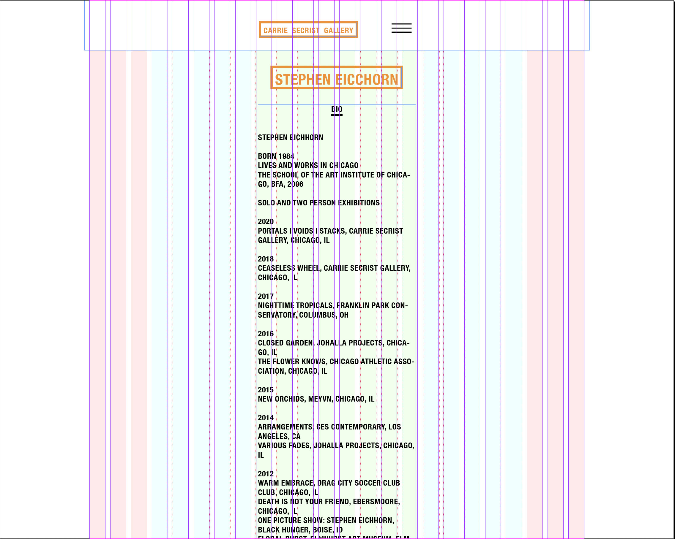
Elements and Restrictions:
Type, lines, shapes, color, images. Use these elements to create coherent styling and to organize and group related content. Establish visual hierarchy.
Restrictions: Type
Choose a Google font(s). Since you may want to use your site later outside of UIC we use the Google Font service to avoid license issues and potential penalties.
Restrictions: Color
Too much color used for the page design visually competes with the color in the project images. If you use color for color-coding more than one color is possible. You could, for example, color code the portfolio sections (visually identify each section with a different color on the page and in the navigation).
Goals:
—Create a coherent visual system of styles. Like in assignment 1 identify pieces of information (title, headlines, subhead, text...) and apply styles systematically. Apply similar styles to similar pieces of information (headlines, subheads).
—Organize content in the grid. Reduce the number of grid columns on smaller screens if necessary.
—Use space generously. Don't place elements too tight together.
—Use contrast to create visual hierarchy (small/big, light/bold, black/white, positive/negative (type and background). How can elements such as lines and background color enhance the hierarchy or help to visually separate sections?