Project 3: Responsive Portfolio Website
We'll be designing and developing/coding a multi-page website showcasing (at least) three UIC projects as well as an About page. The idea is to build a site that can grow over time. It needs to be designed so that you can easily add upcoming classes/projects.
We will be working with collecting and saving images for the web, mocking our designs pre-code, and using Webflow — which is a web-based application to code. Each step will build upon each other to the final process of coding and publishing the site.
View portfolio website examples here:
Content Modules:
A good way to think about this may be to divide the site content into modules. And then decide if those modules are being presented on separate pages or if some (or all) of them can be combined on a page. The navigation menu should not include links to single project pages, rather only links to overview pages. That way, if you add a project to your site, you'll only need to add a link to one of the overview pages and then create a new page for the project itself. The navigation menu, which exists on every page, doesn't need to be updated in that case.
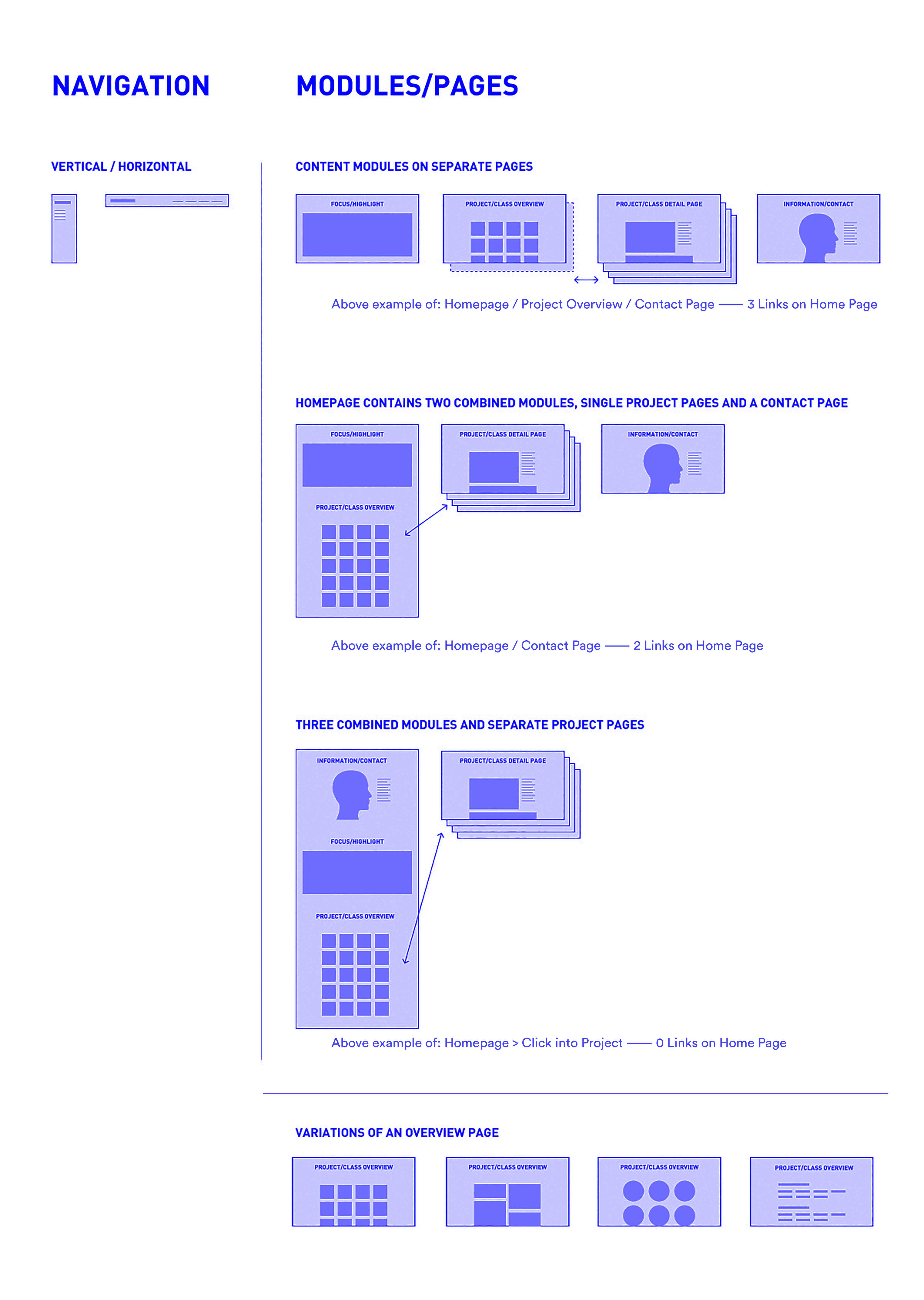
Structure:
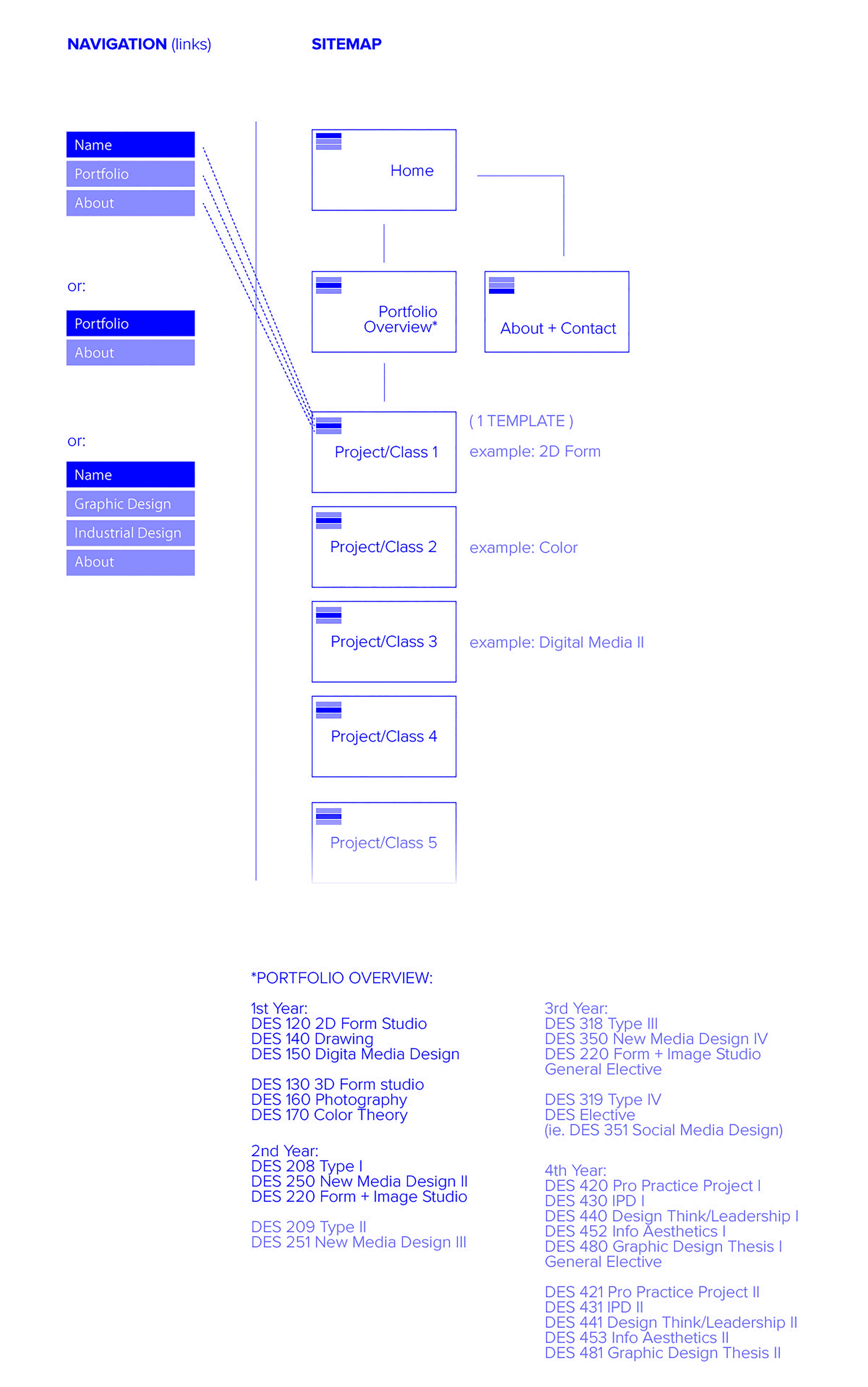
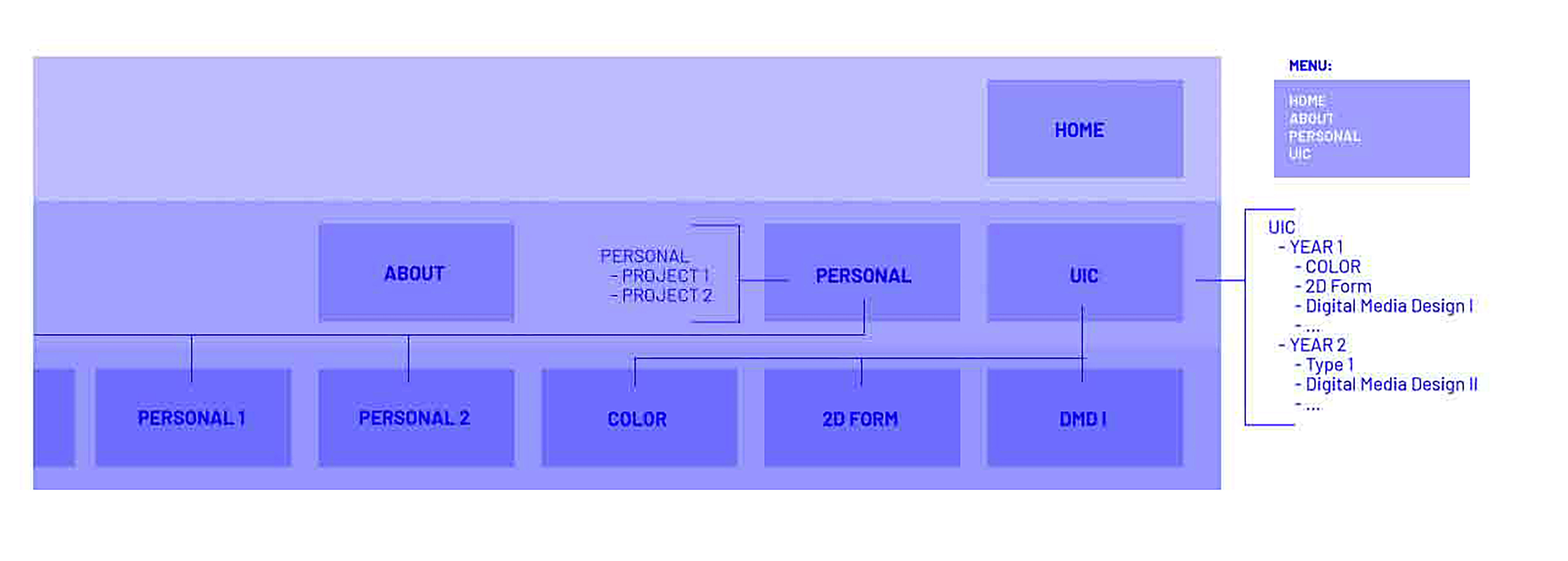
The following sitemap shows an example structure/sitemap. When looking at a sitemap you get a pretty good idea how pages need to be linked.
This structure requires 3-4 different page designs (templates):
- 1. HOME page
- 2. PORTFOLIO overview page
- 3. CLASS/PROJECT page(s)
- 4. ABOUT page with contact info
- HOME page and PORTFOLIO overview page could be combined (or HOME and ABOUT pages, or in fact, all three of them).
Although you'll have numerous project pages — you'll only need one page design/template for it. Headlines, text and images will change, of course, but the design can/should be the same for all project pages. There may be slight differences between the project pages such as color coding or icons that can help people identify in which section they are.
Navigation:
The navigation above is part of the sitemap diagram so don't think it has to look like that. It can have any form as long as the 3-4 links are used. "NAME" in this example would link to the HOME page but you may call this "HOME" instead and have a separate placement for your name. Name and navigation should be visible (or at least accessible) on all the pages as a site identification. If we use this setup you can add as many projects you need over time without having to adjust the main navigation. To navigate to the different projects, the simplest is to switch between the PORTFOLIO Overview page and the CLASS/PROJECT pages. To view a project (for example "Color Theory") you click a link on the PORTFOLIO page. And on the project page, you click on "PORTFOLIO" to get back to this overview page. Avoid having class/project links on the individual project pages because it would mean you need to update the navigation each time you add a new project.
Sitemap/Navigation: Possible Scenarios
Below are some possible options. The sitemap will often directly affect the navigation menu.
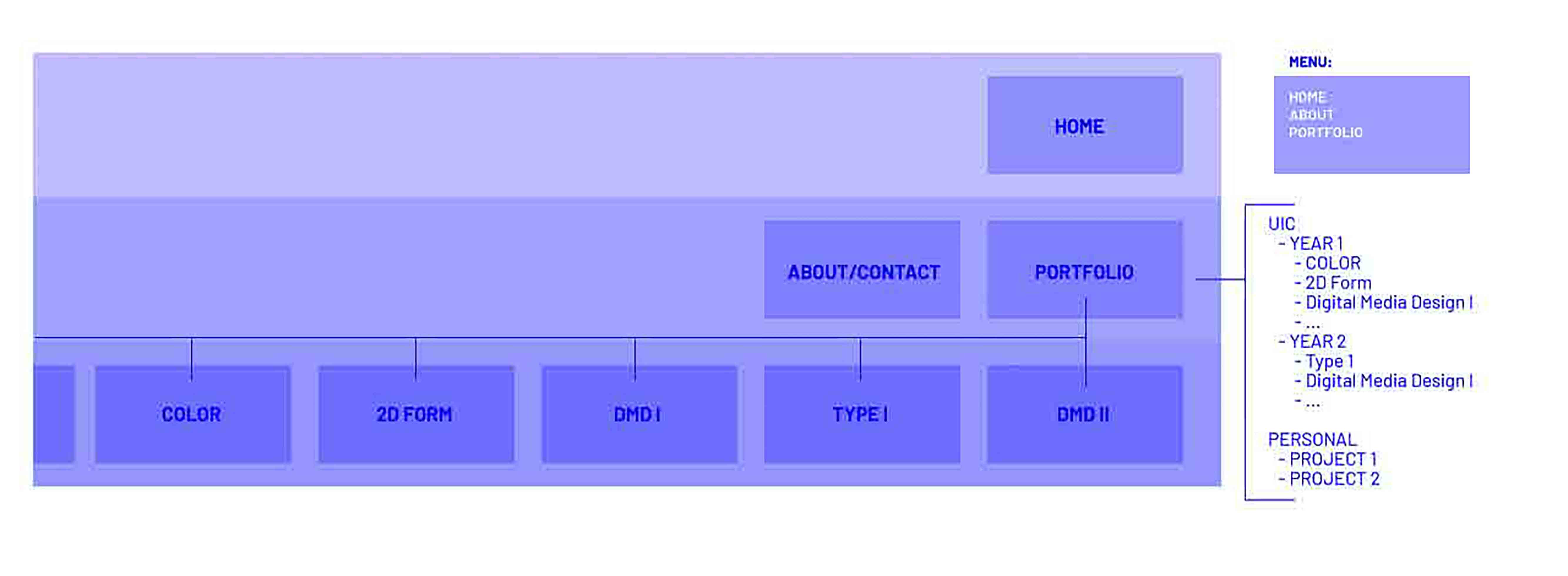
3 levels: PORTFOLIO overview page contains list with links to all project pages. The project list could be just type or images (or a combination of both).
This structure could easily turn into a 2-level navigation if the HOME and ABOUT pages are combined.
You'd navigate back and forth between the PORTFOLIO overview page and the class pages/project pages.
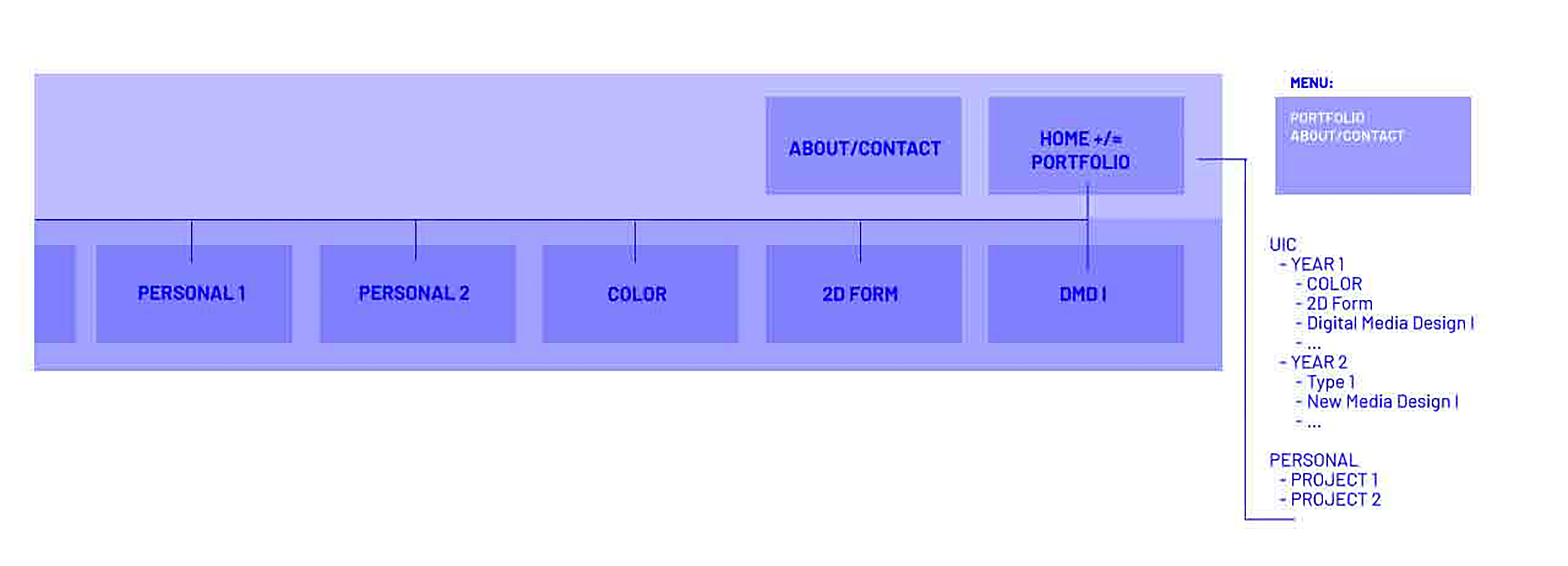
2 levels: Here the HOME and PORTFOLIO pages are combined. Only two links in navigation menu.
3 levels: PORTFOLIO split up in two sections. More links in navigation menu but clearer separation of UIC and PERSONAL work (provided you want to show personal work).
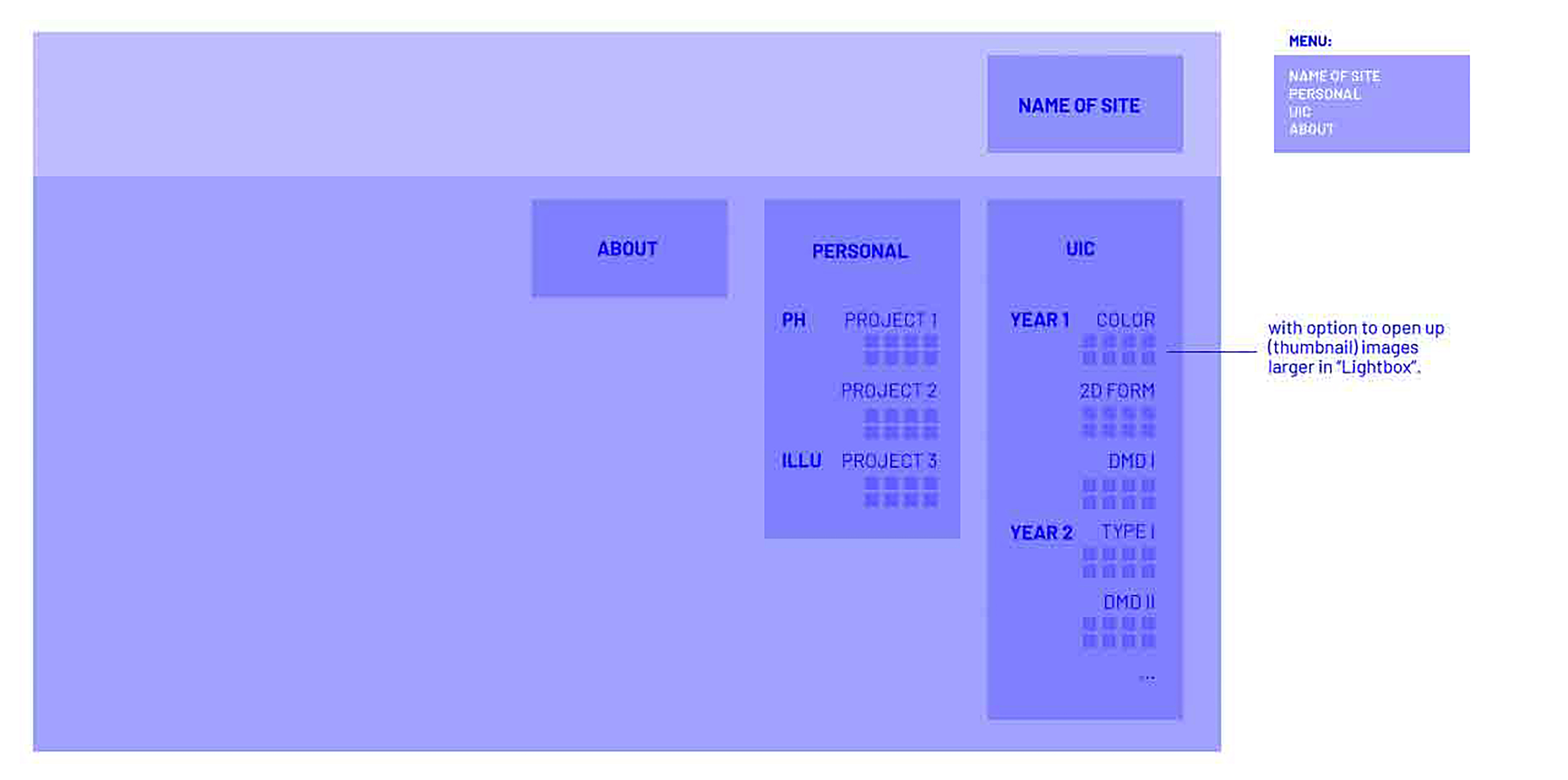
2 levels: UIC and PERSONAL sections are long pages containing all the classes/projects. In order to keep scrolling limited, the project images should be small but could be opened up larger in a Lightbox/Slider.
Image Preparation for the Web:
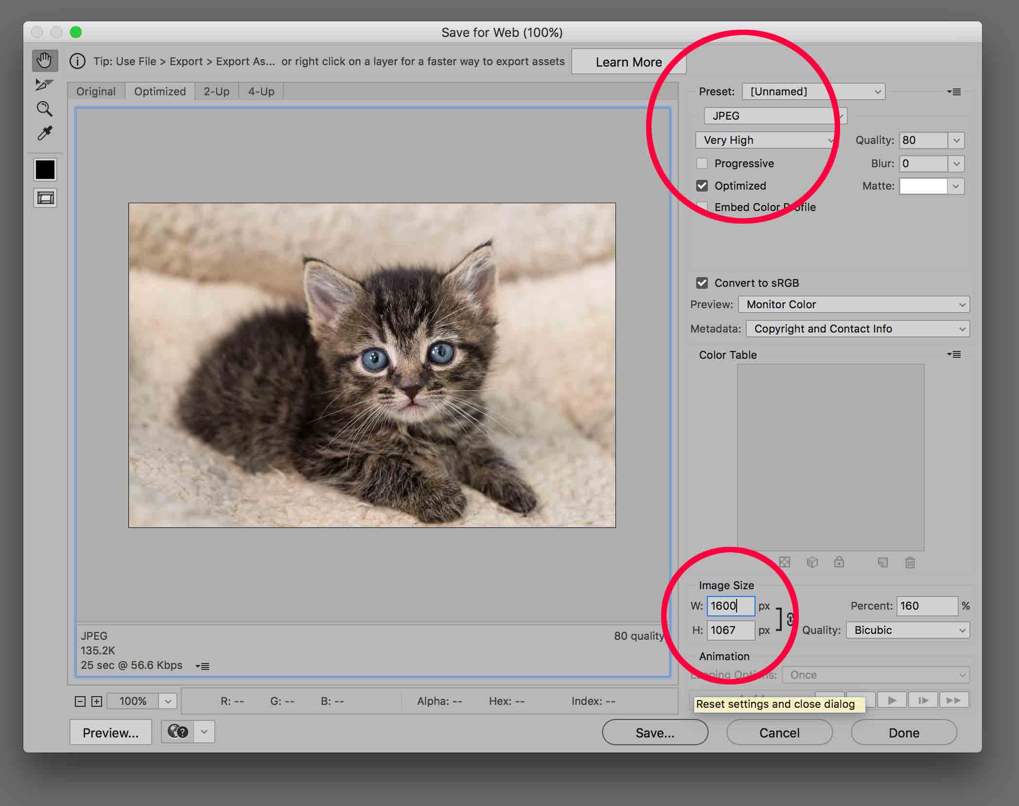
Start to collect images from your class projects. Make sure you keep them organized in folders. The image size depends on the layout in the end. If you don't know the final image size yet I recommend to collect images at around 2000px in width (big enough for most purposes but not too large). Save them as JPGs. The image file sizes need to be as small as they can be to ensure quick page loading times later. But the image quality needs to be the best possible at that file size.
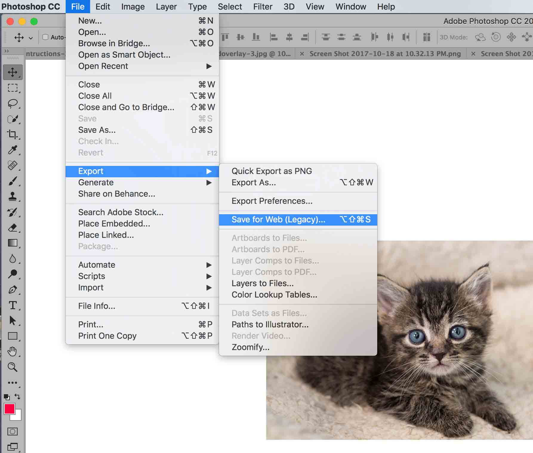
In Photoshop use the EXPORT — SAVE FOR WEB option and save images as JPGs using the "high" or "very high" setting. Using the Save For Web option results in the smallest possible file size for the image quality chosen (= the most "optimized" image).
You may need smaller, cropped versions of some of those images later (think small images thumbnails in a grid). For this open up the 2000px width image in Photoshop and scale/crop it before you Save it for the Web again.
Don't place images in your code files that are too large! Even at its largest size (around 2000px in width) the file size should be under 500K.
For our next class: We will begin mocking our designs in indesign.
—You will need a folder with your images prepared and your projects that you want to include.
—Come to class with the images ready to be placed in your design mocks / content to include for the projects (project brief text) / contact and about information.