Project 2: Design and code a responsive web page for an event using a grid layout as a base.
Schedule:
TU 09-10: 2_1: RWD Text
TH 09-12: 2_1: RWD Text
TU 09-17: 2_2: RWD Text + Lines
TH 09-19: 2_2: RWD Text + Lines
TU 09-24: 2_3: RWD Text + Lines + Shapes
TH 09-26: 2_3: RWD Text + Lines + Shapes
TU 10-01: 2_4: RWD Text + Lines + Shapes + Color
TH 10-03: 2_4: RWD Text + Lines + Shapes + Color
TU 10-08: 2_4: RWD Text + Lines + Shapes + Color
TH 10-10:2_5: RWD interactivity Due
This assignment focuses on applying CSS styles. You'll be coding and designing an event schedule following a given process. I setup the basic HTML and CSS so that we can focus on the design rather than building everything from scratch (which we'll be doing in the last assignment). The prepared setup is a grid based layout built with the CSS flexbox model.
The idea here is to work directly in CSS code to learn what the limits and possibilities are and to make design decisions within those restraints. Goal is to create structure, hierarchy and visual interest to make the given content easy to understand and engaging.
The Event is the 3 day Pitchfork Music Festival. The page we'll be designing is the lineup over 3 days and 3 stages with artist names and set times.
1) Step One:
Listen to this playlist from the 2024 Pitchfork Music Festival: Pitchfork Music Festival 2024 Playlist on Spotify or on Youtube
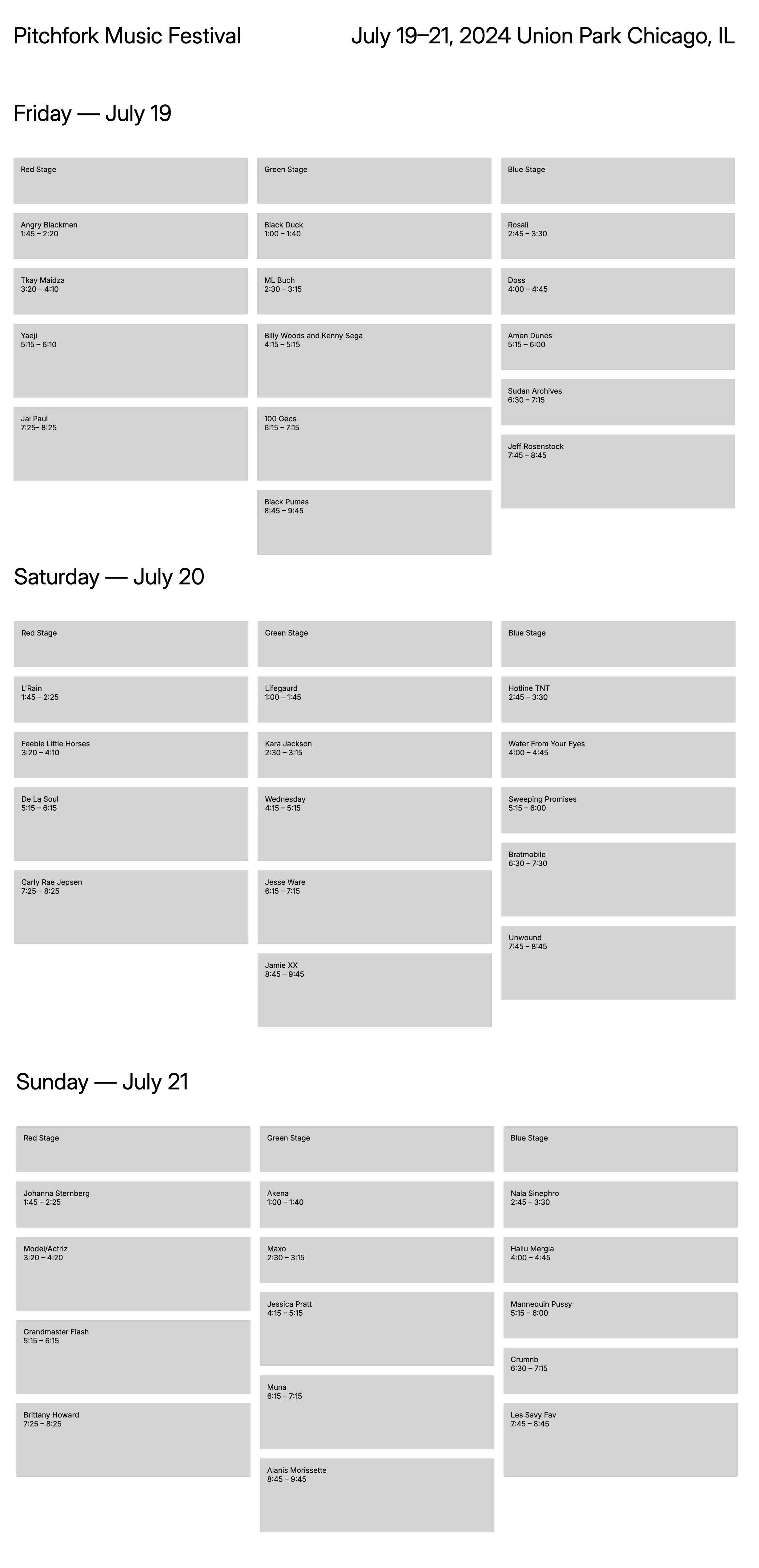
The template you'll be working with is a grid layout with 3 columns for each stage. Each grid item/unit contains the artist names and set times. The height of these items corresponds directly with the length of each set. There are sets each day that happen simultaneously divided into the 3 stages.
Learn more about the template and it's folder and file setup towards the bottom of this page.
2) Step Two:
Below is the template how it appears in the browser:
As you can see there are hardly any styles applied that relate to overall design/typography and hierarchy. What's given is the grid and some spacing to separate the days, stages and individual set times.

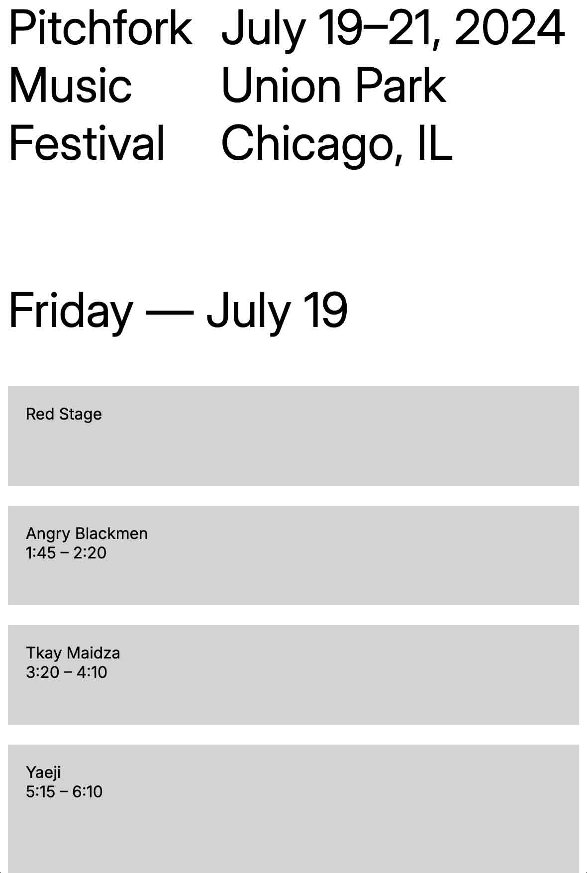
Here's the responsive behavior:
On a phone and tablet it's a one-column layout, and on bigger screen it's a 4-column layout.

3) Process:
The example below shows the overall design process. We start with a layout on a grid using text only (2_1). Then we add lines (2_2), lines and shapes (2_3) and then lines, shapes and color (2_4). Note that this example only shows the behavior on a big screen. All the layouts need to be designed and coded responsive for all screen sizes.

- 2_1 / Work with font size and/or weights as well as spacing and alignments to enhance legibility and hierarchy.
- 2_2 / Pick a design form 2_1 and add line elements to further enhance legibility, structure and hierarchy.
- 2_3 / Pick a design form 2_2 and add line shapes (background colors) to further enhance legibility, structure and hierarchy.
- 2_4 / Pick a design form 2_3 and add line elements to further enhance legibility, structure and hierarchy.
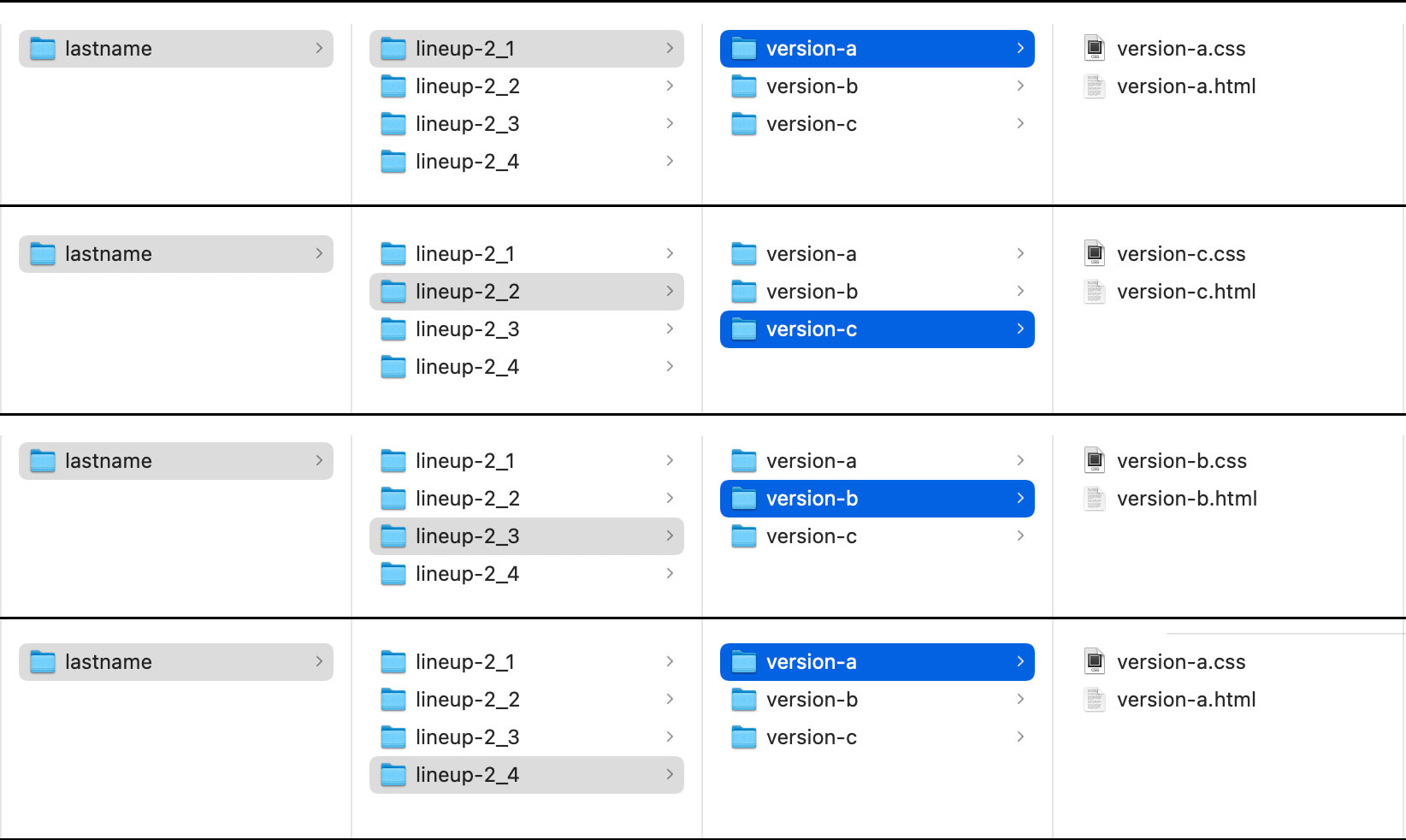
4) Organization: Folders and Files
You'll be creating 3 design variations (a - c) for each process phase (2_1 - 2_4). The following image shows the folder and file structure you should follow. We'll be separating HTML and CSS code for this assignment so each variation/version will have its own HTML+CSS.
