Assignment 1: HTML Basics: Structure/Meaning and Responsiveness
Schedule:
TU 08-27: Introduction/Overview
08-29: 1. HTML Basics
TU 09-03: 1. HTML/CSS Basics
TH 09-10: 1. HTML/CSS Basics due — Start of Class
Design and code a given text responsively for a web page. Apply HTML tags to the text to give it structure and meaning and then apply CSS rules to style the text. The goal is to make the text easy to understand and legible by giving it hierarchy and visual interest.
See the Pen Assignment 1: Text by Oliver Roeger (@uic-des) on CodePen.
Step 1: HTML setup
Please read the post: "HTML Basics" for reference.
DREAMWEAVER is part of Adobe Creative Cloud and it's likely that you already have access to the software. We'll be using DW as a code editor not as a design tool. So none of the pre-coded, template based featured will be used. Although DW has some useful features such as the side by side code/design views, it's possible to use a different, more affordable code editor instead. If that's the case please let me know.
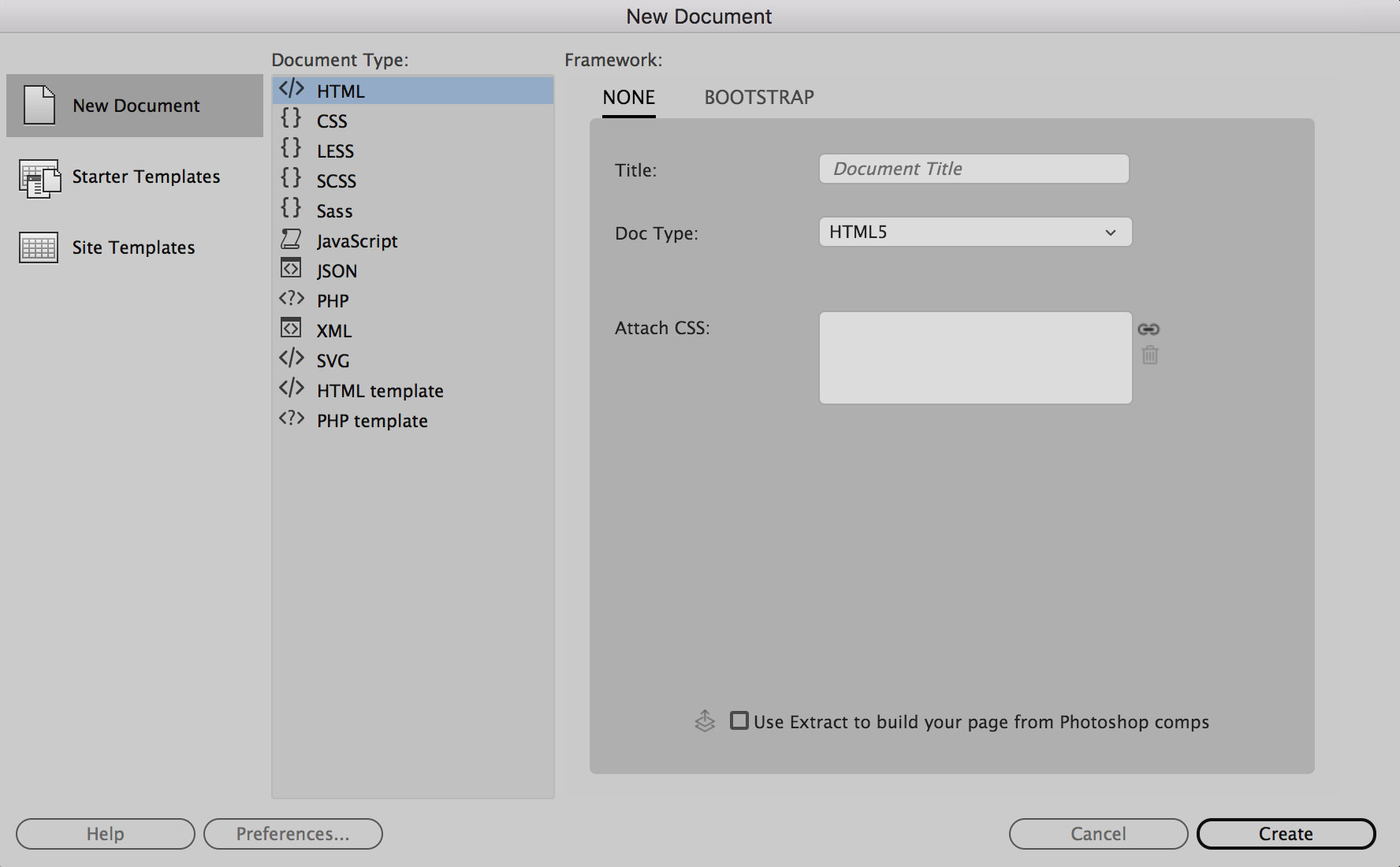
Open DW and create a HTML page by choosing FILE / NEW. Select a blank HTML document an hit CREATE.
Then copy and past the text in between the body tags and apply the appropriate HTML tags to the given text:
See the Pen Untitled by jon k (@jkrohn) on CodePen.
The text has one headline followed by two paragraphs. Then two separate lists with subheads and list items. Then another paragraph in the end. The appropriate HTML tags to structure this essay are :
as shown below:
See the Pen Assignment 1: HTML tags by Oliver Roeger (@uic-des) on CodePen.
This next step will give the text structure and meaning and to ensure better legibility. Each web browser has built in default styles for the HTML tags so that a text is legible without applying an additional styling language (CSS). We'll apply our own styles in one of the next steps.
See the Pen Untitled by jon k (@jkrohn) on CodePen.
Step 2: Embed a font
If a specific font is not assigned to the page the user's web browser will pick the default font that is chosen in the browser's preferences. In order to ensure a consistent page appearance across all browsers, independently for the user's default settings, a web font it must be embedded.
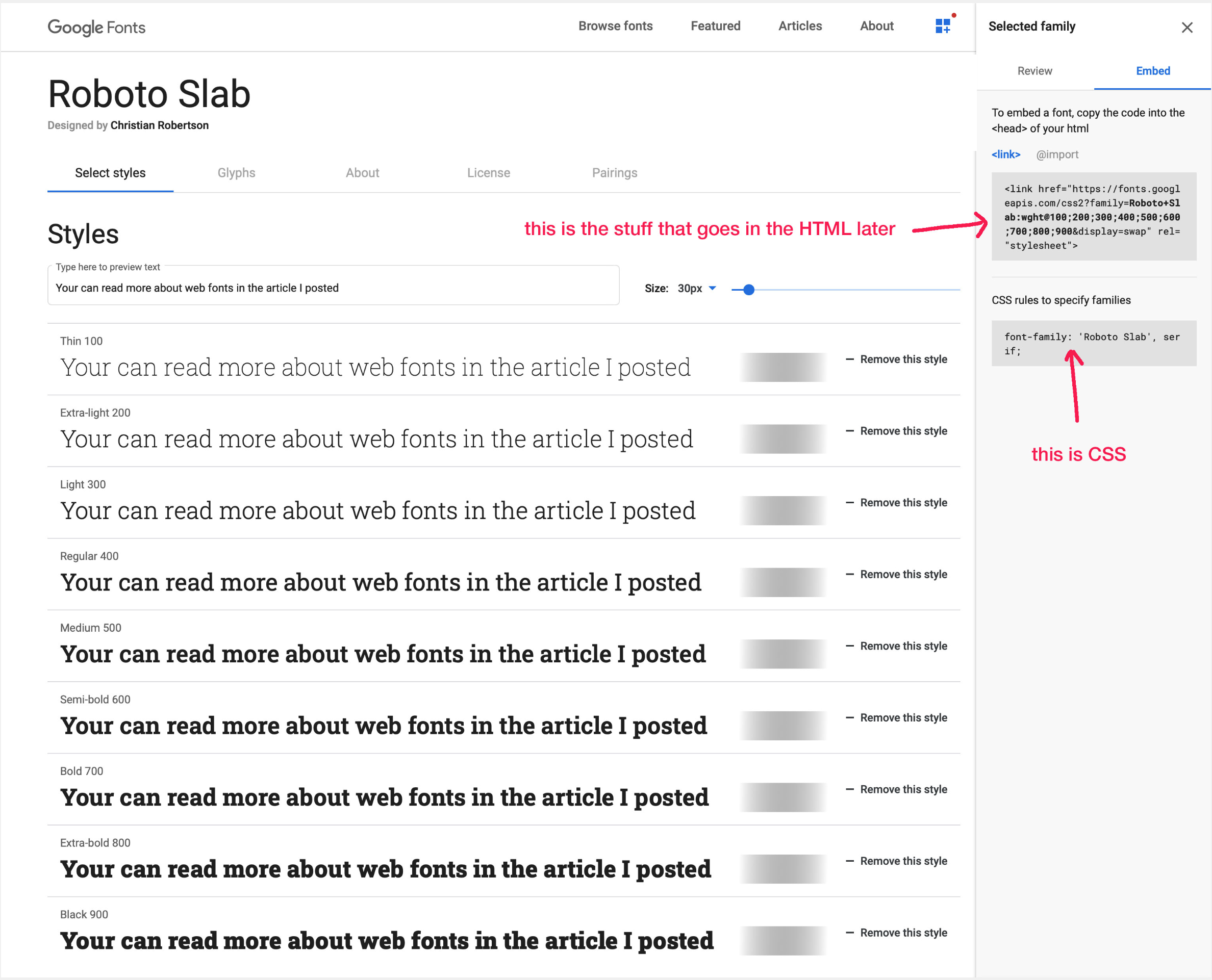
There are different ways to embed a font to a web page. Throughout this semester we'll be using Google Fonts since it's (copyright) free and very easy to implement
For this assignment, we'll be using Roboto Slab. It has multiple weights which comes in handy if you want to create visual contrast and hierarchy. Google fonts can be downloaded and used on your computer in a layout program and can be used on web pages.
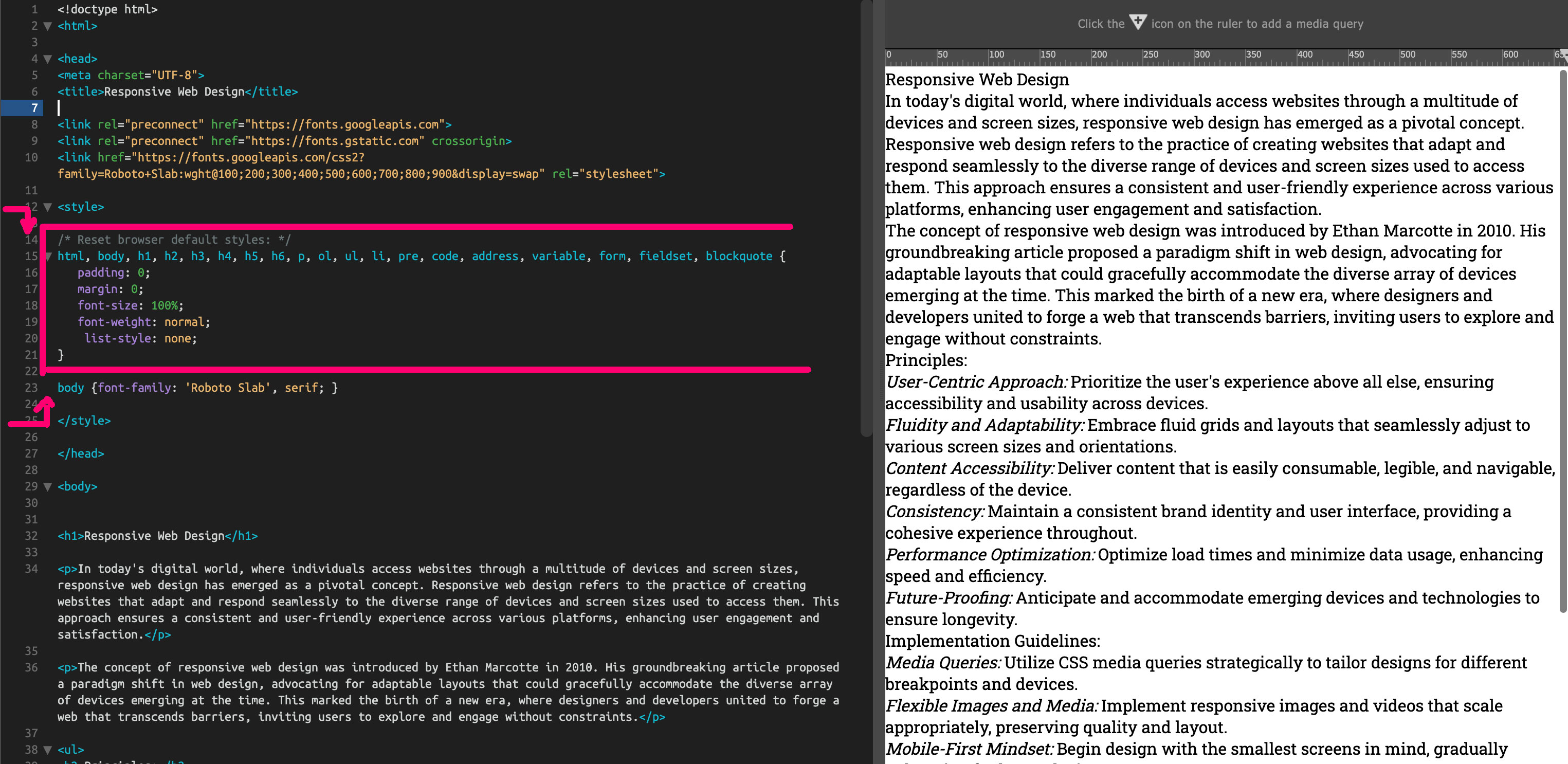
You will need to first copy and place in the Head of your HTML file as shown with 1). Then copy 2) and and place within your CSS.
Step 3: CSS
Please read the post CSS Basics for reference.
For this exercise we'll be working with so-called "internal CSS" which means also separated, the CSS will be added at the top of the HTML page. It's much more common to keep HTML and CSS in separate documents but since this is only one page and a basic exercise, internal CSS is easier to manage. Please read Css Basics for the 3 different ways how to add CSS.
The CSS Reset
In order not to be confused with browser default styles and to have full control over the styling we'll apply a so called "CSS Reset" to our setup. Copy and paste the CSS code in between the "style" tags of your HTML source code.
See the Pen CSS Reset by Oliver Roeger (@uic-des) on CodePen.
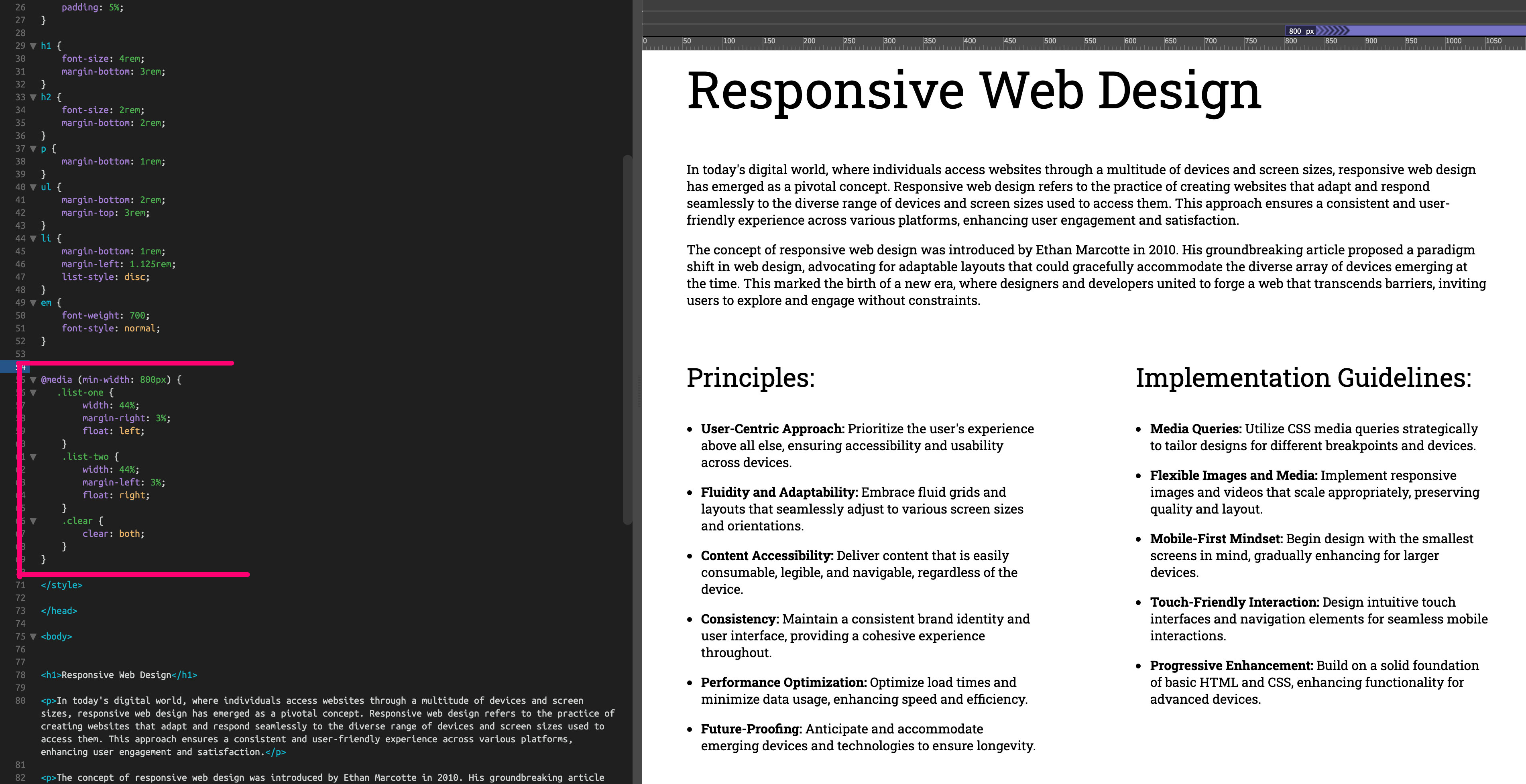
STEP 4: Responsive layout with CSS Media Queries
Although the layout with the styles applied may work on smaller screens now, it's not yet optimized for larger screens. The way to improve legibility and structure designers often divide page content into multiple columns (or layout grids).
In our example the two lists could more narrow and placed next to each other since there's plenty of horizontal space available on larger screens.
You can decide and control at which screen size the two lists need adjustments. The defined screen sizes when those adjustments happen are being called "breakpoints". The CSS Media Querie defines those breakpoints and list the rules and declaration that need to change.
See the Pen Untitled by Oliver Roeger (@uic-des) on CodePen.
As you may notice in the code, the HTML lists have now an added class name. That makes it easier to apply unique styles to the two list defined by the "ul" (unordered list) tag.
STEP 5: Play around with styles to further enhance structure, legibility, hierarchy and visual contrast/interest.
Explore possibilities with CSS styling by applying CSS rules to HTML elements.
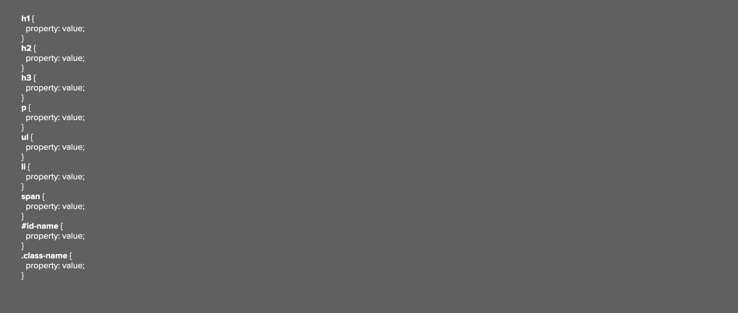
Examples of HTML Elements you can target with CSS Styles:
Example CSS Properties (with random values as examples)
- font-size
- font-family
- letter-spacing
- line-height
- text-transform (capitalize, uppercase, lowercase)
- text-align (left, right, center, justify)
- word-spacing
- margin (space between elements)
- padding (space between text and edge of element)
- vertical-align (alignment of text element within another text element)
- float (left or right; used to make elements appear side by side)
- display (block, inline-block; used to make block elements behave like non-block elements, or non-block elements behave like block elements)
- border-top, border-right, border-bottom or/and border-left (adds lines to elements)
- color (changes font colors)
- background-color (changes background colors of text and elements)
Don't use the following declarations:
- font-variant (small caps are bad if font is not designed for that use!)
- font-style (not oblique of italics yet, part of the restrictions)
CSS Box Sizing
This is a small addition to your CSS that makes it easier to calculate widths and heights. If used, an element is defined by the "width" value independently from borders and paddings.
See the Pen CSS Box Sizing by Oliver Roeger (@uic-des) on CodePen.
Example Design:
See the Pen Untitled by Oliver Roeger (@uic-des) on CodePen.
STEP 6: Interactivity with added Hyperlinks.
Add two hyper links to the second paragraph inside the HTML and style the look and behavior with CSS.
See the Pen Untitled by Oliver Roeger (@uic-des) on CodePen.